
![]()
Data Visualization and Information Management
Background
Good data visualization and information management go hand-in-hand because without
effective information management, filtering, querying or subscription, it is impossible to have good visual displays. Good data visualization is a presentation that allows a viewer to better understand relationships between the data displayed by
presenting only enough information to provide adequate context for the data. Visualization is important because people think in images
- a skill developed long before they learn to read and write.
People gain understanding by working with only a few pieces of information at one
time. Thus, displays must be kept simple. Whereas this might sound easy, it is not, and
it gives rise to areas of specialty and skills such as mapmaking. Mapmakers or
cartographers have long followed the principle
of display simplicity when creating maps. All maps display selected information about an area, not all
available information. If all information available on a specific area were placed on a map, the map would have so many lines, points, and
areas it would be illegible. Map users, therefore, want a map of the world to show only the boundaries of countries, the outline of oceans, and the locations and names of major
cities. Road users want maps to show only roads. Road maps filled with too much
other information obscure the roads and render the maps useless. World maps with too much information are unsatisfactory because they may hide country boundaries and small
cities.
Techniques for Improving Data Visualization
A. Break Data Down Into Subordinate Parts
Whereas the technological movement is to increase the computer's capacity for processing information, the human ability to assimilate information is relatively constant. Most psychologists state that the human mind can only handle 3 - 7 variables at one time. Given more than that, our
inability to fully understand more information makes us vulnerable to emotional influences. This devalues past experience and reduces our confidence when dealing with complex situations. Studies suggest decision-making declines with too much information because of the difficulty
of integrating all of it. Keeping it simple is the same challenge faced by
cartographers; so that what is important is not lost in volumes of detail. It is no different when referring to visual displays.
The military recognizes this and provides staffs to commanders of battalions and larger units
to assist in managing information. Each staff section monitors and manages a particular category of information. Because this need to have specialized staff sections stems from peoples' limited capability to absorb information, particularly in a rapidly developing situation, staffs are just as important with computers as they were before computers.
B. Data Reduction
One way to improve displays is with data reduction - reduce large quantities of data to the few important pieces of information through analysis and filtering. The aim of data reduction is to facilitate situational awareness. One example is computing the average of 100 numbers. A military example is the intelligence preparation of the battlefield (IPB) process. Users of this process start with scores, hundreds, or thousands of pieces of data representing hills, roads, rivers, marshes, towns, enemy units, weather, and many other elements that collectively describe the site of probable military action. Using the IPB process, successive new pieces of information are created until a few Named Areas of Interest (NAIs), Target Areas of Interest (TAIs), and Decision Points (DPs) are created. Military use of data reduction is not limited to the IPB process; all military planning involves data reduction in some form.
C. Heads Up Display
One method used to display only essential information is the visual heads up display
(HUD) used by aircraft. Because aircraft move very fast, essential - not just nice to
have - information must be presented in such a way that is easy to find and
understand when operating in a fast moving environment.
Interestingly, it has been found that visual information displays are most effective when they show only a few objects of interest, usually five to nine. An operations center may have big map displays with many details, but most of
the details such as contour lines, road networks, and rivers simply provide a background
or context against which to view the few objects of interest.
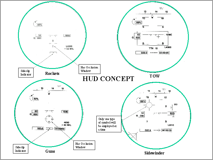
The image above, taken from four Cobra helicopter
heads up displays, provides HUD examples. The terrain outside the helicopter provides the background or context against which the few pieces of information in the
HUD are viewed. Notice that the information presented varies with the weapon to be fired. An information display appropriate to one weapon (and situation) is not appropriate to another.
D. Overlays
The limitations of simple paper maps are easily overcome by the use of acetate overlays. Using marking pencils, additional information could be annotated on
an overlay and thus, over a base map. Changes to a base map could be made by marking on
it or on an overlay. Because simple information displays are much easier to understand than complex displays, overlays have also been used to segment
information. The most common example is placing of intelligence information on one overlay, maneuver information on a second overlay, and fire support information on a third overlay. The basic concepts in
information overlaying are:
(1) Reduce large quantities of information with multiple, simple displays.
(2) Keep a map current by updating only the information elements that are important to the
map users.
E. Standard Reports
Another tool that helps data reduction is the use of standard reports. The military uses this technique to acquire only essential information and to reduce ambiguity.
The visual identification and location of units, ships and airplanes helps facilitate the decision-making process in fast moving situations. Identifying critical
elements before hand facilitates the movement of data and displays. The
presentation of unneeded information can hinder the processing of important information and lead to the unimportant obscuring the important on information displays. Information priorities must be
initially established and promulgated and then adjusted as a situation develops.